Typeface Analysis
Jonathan Barnbrook's "Mason" Typeface
Jonathan Barnbrook designed the typeface “Mason” in 1992 to merge historical and modern contexts into a unconventional, recognizable, and bold design. This typeface utilizes visual imagery that alludes to its context, a main mission of Barnbrook, and confronts the expectations of typographic designers. Through “Mason”, Barnbrook is able to achieve more than just communication of text, but also ideas, associations, and normality.
The design of the typeface has many key features:
- Sharp Letterforms
- High Contrast Strokes
- Irregular Proportions
- Stylistic Hybrid
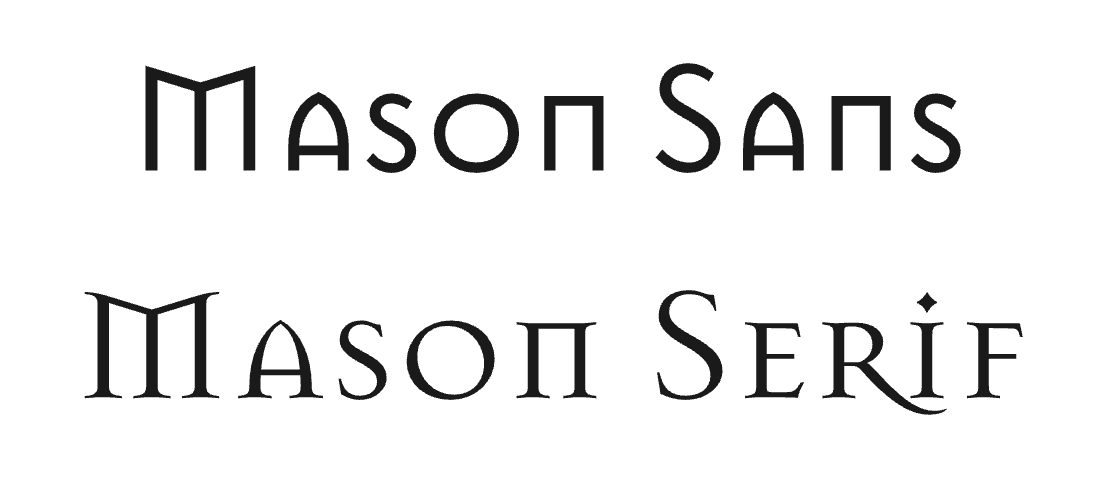
"Mason" Font by Jonathan Barnbrook (1992).
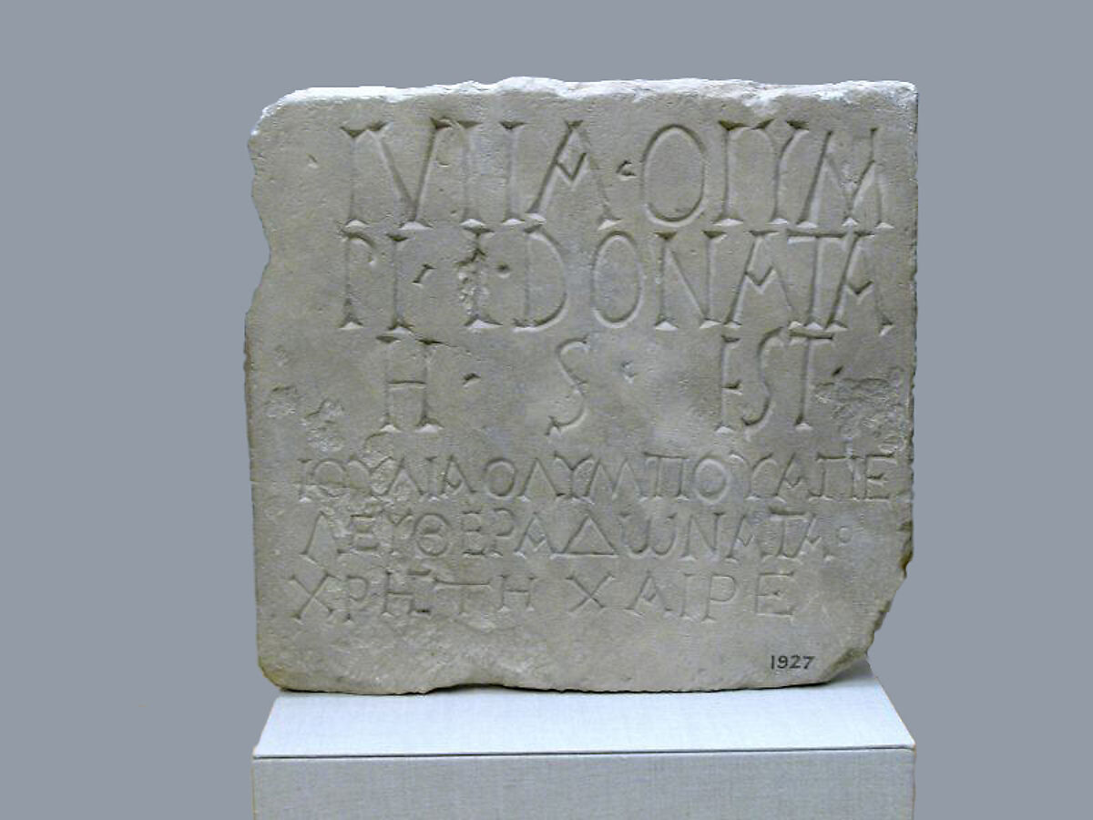
Roman Inscription.
The sharp letterforms are clear through the pointed terminals and geometric shapes that are striking and angular. This choice is clearly reflecting the reference of the type's name, as masonry is the practice of construction, which utilizes solid forms of materials that are incredibly strong. The shapes play on horizon and simplistic designs of buildings, while also appearing sturdy and durable.
The strokes are comparable to serif typefaces but are extremely exaggerated. This exaggeration most likely comes from Barnbrook’s desire to exaggerate and challenge the standard practices of typographers. The proportions are also in a similar perspective here, as both thick and thin parts of the letter appear. This continues to further identify with the rest of Barnbrook’s work and his ideas/concepts as a designer.
The font is a somewhat hybrid of other typefaces and styles that have come previous to it. It can be compared to old physical inscriptional Roman type, and the modern Futura. There’s also slight elements of gothic to this type, as the structure is somewhat similar to the style. This continues Barnbrook’s tendency to merge the past and present, while also pushing boundaries that are already present in the industry, by mixing typefaces that are not necessarily thought to work together.
“Mason” has specific conceptual undertones that ties into the design that Jonathan Barnbrook made. The name comes from Freemasonry, which is one of the oldest fraternal organizations on the planet. This could be another reason why Barnbrook merges the past and present when designing this text. The design pulls from various religious texts, occult symbolism, and classic architecture in order to tell the story of the typeface and give a meaning to it. The typeface has a clear air of mystery and authority around it, alluding to what gave the name to it.
Overall this typeface inspired designers to pursue expressive designs that challenged the common modernist neutrality that was dominating the industry at the moment it was designed.
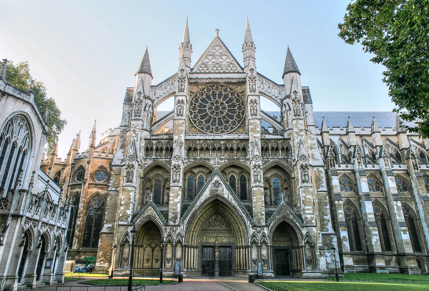
Gothic Architecture of Westminster Abbey in London, UK.
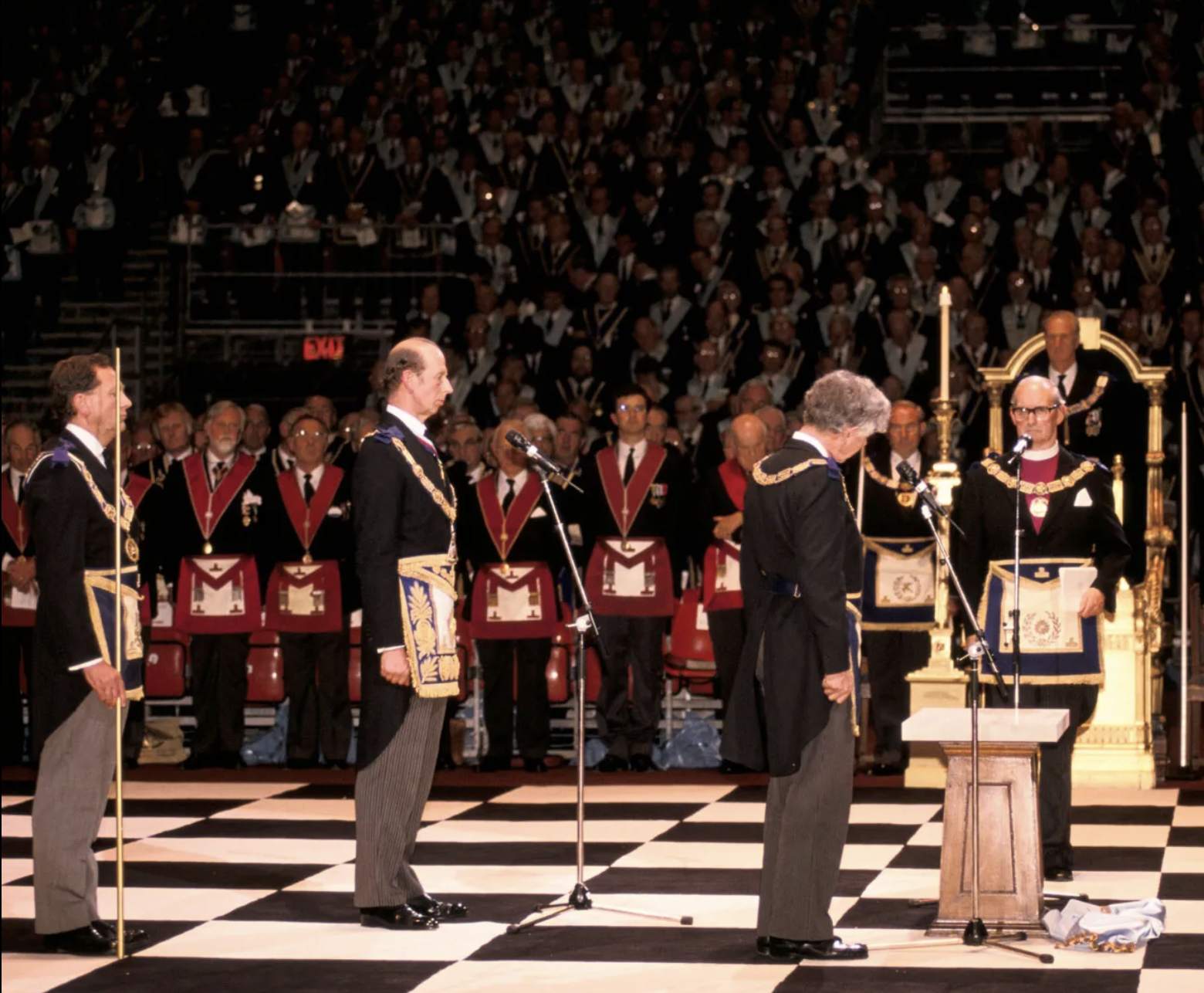
A gathethering of Freemasons.